EMBASSY SUITES
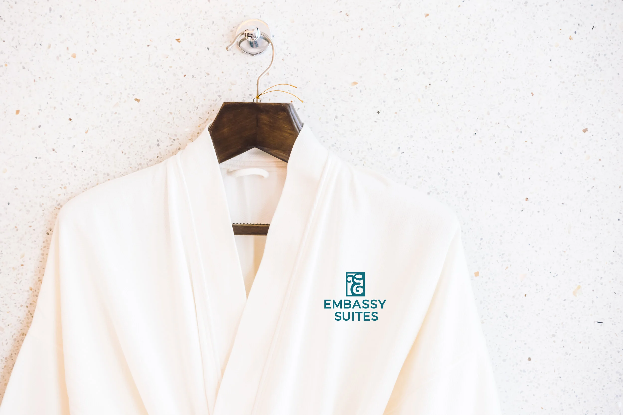
The focus was to update the Embassy Suites logo with a face lift, and update the brand applications. With the hotel updating over 150 of their locations, I thought that the logo should match the new modern, minimal interior design of the establishment. The old logo was recognizable by many, so I didn’t want to change it too much. I kept the “E,” but changed it to a flowing script type, and switched the name to a sans-serif typeface for a cleaner look. I made their original teal color darker and more blue to match much of their grey and neutral colored interiors. A brand guidelines manual and stationery were created as well.